

Web Design is turning out to be one of our favorite duties here at SMart Studio. Not only does it allow us to create exiting eye-catching graphics, but includes motion and animation, sound effects and music, and many other elements that 2 dimensional designing never allows. These elements, combined with our own fevered mania for making things cool, is turning into a powerful function that we are happily making available to you.
Warlord, The Hand Of God .com
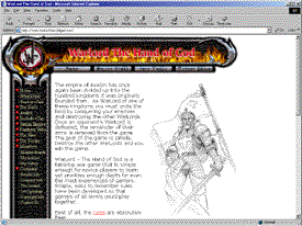
This site was brought to my
attention by a friend of mine who also designs web sites. She was nice enough to asked me to help come up with some medieval looking graphics to make it look all cool & stuff. How could I refuse. Originally, the background for the
site was going to be solid black, and as you will see below, most of the elements were designed for that. Since the posting of the site, they have opted for a white background which is what you see to the left here, and on their current
site.
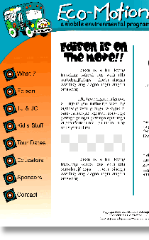
Ecomotion.org
This site is in its early design stages right now. The
proposal for this new site is in committee awaiting final approval. The current site doesnt offer much functionality as is, where this will allow the people at Ecomotion to supply learning materials via the internet through downloads from
this site. It will also give a good overview of the Ecomotion project, and introduce the general public to Edison, the school bus that has been converted into a mobile environmental classroom. It will also allow them to showcase past
events, plus list up and coming events with an online calendar, and just about anything they decide to include.
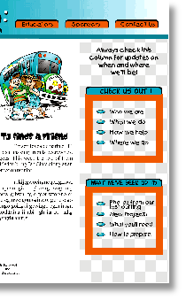
Check back for updates.
MUCH MORE COMING SOON!
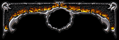
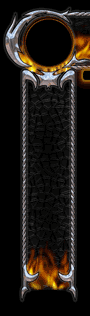
This is the original idea and design for the top title bar. The intent was for the Warlord logo to fill the blank circular area in the center.
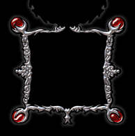
Along with the top, this center frame piece was intended to be placed just below the logo area of the title bar and would allow for multiple graphics to flash and change as the browsers mouse passed over it.
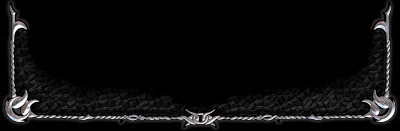
This is, of course is the bottom piece. It keeps everything on the page from escaping.
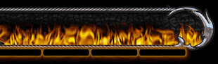
This is the final look that was agreed on.
It still has a place for the logo and supplies button spaces across the bottom of the title bar. This
design ended up being less memory intensive but still looking very, very good. The buttons were eventually changed to the more chrome, metallic look.

Click here to continue on to

Please remember, as with all projects displayed on this site for example purposes, these images are not to be reproduced or used in any
way without expressed written permission as they are the property of the client/creator.
All rights are reserved, copyright SMart Studio 2002.